This personal project started with the need of the company I am curating the imagery for, to shift the visual identity to a more authentic approach of photography. One of the websites that offer this visual style is EyeEm. It is always a pleasure for me, having a photography background, to browse through this type of content as opposed to stock pictures I got used to while processing corporate commissions.
I presented the pitch to the Marketing team of the company to be able to allocate some budget to the commercial subscription of the website.
As the presentation is confidential I reworked the project to be able to publish it on my portfolio.
The purpose is the same as the one I presented to the team:
conveying a specific concept through the best selection of visuals.
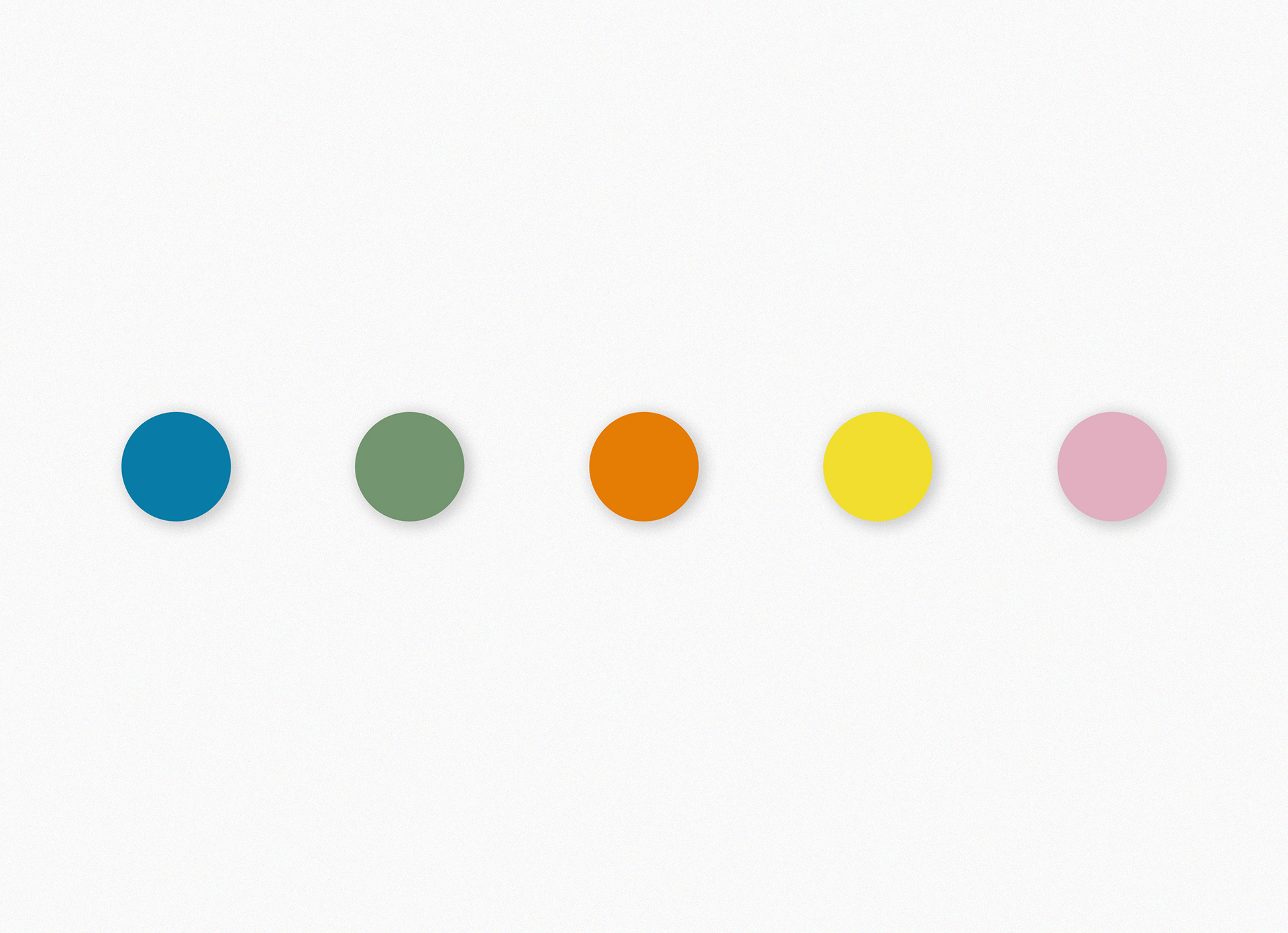
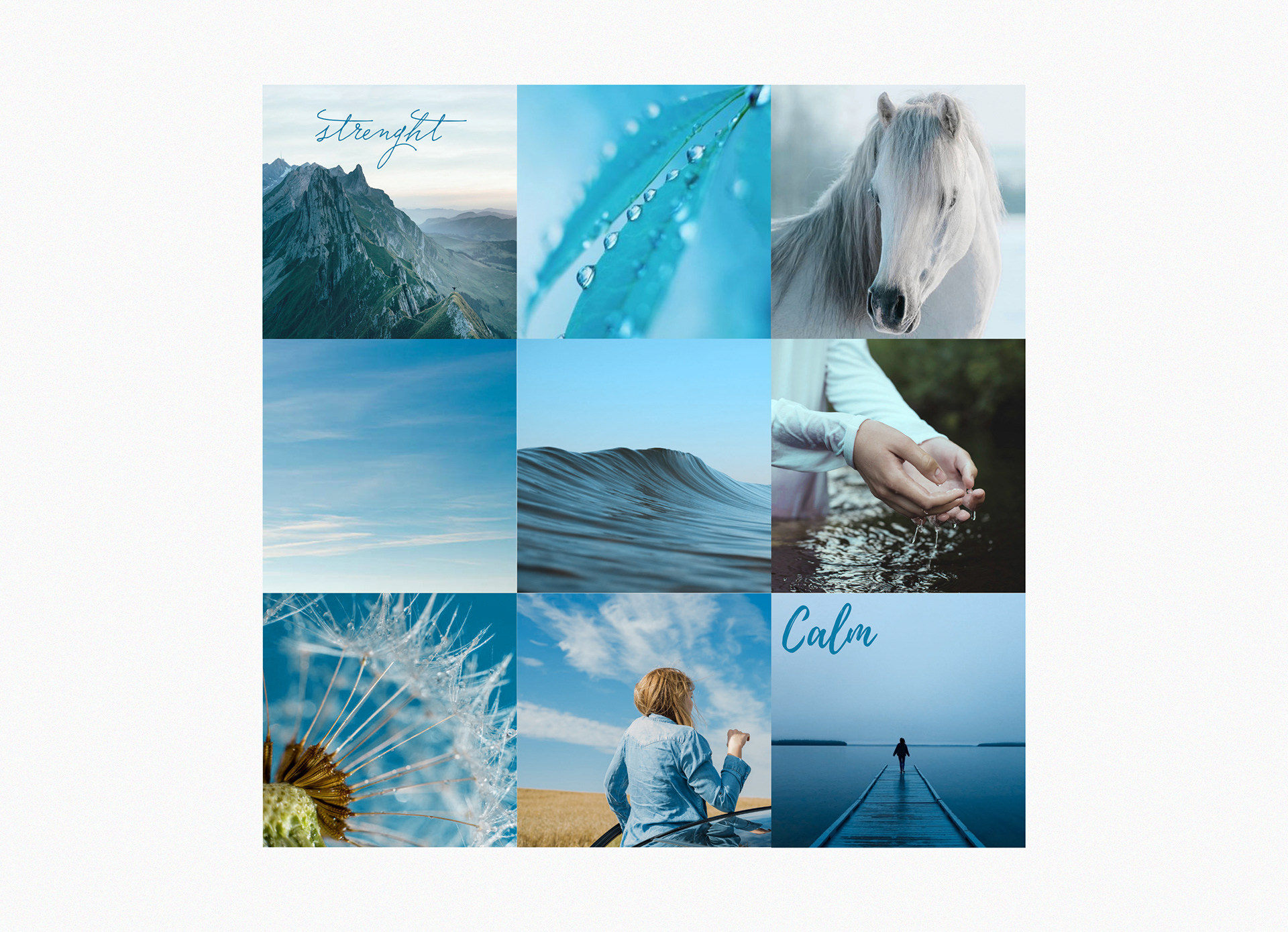
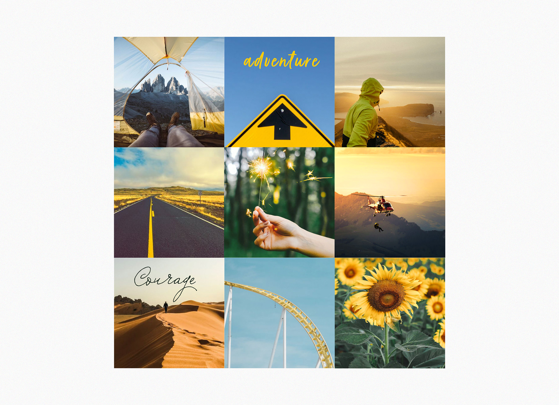
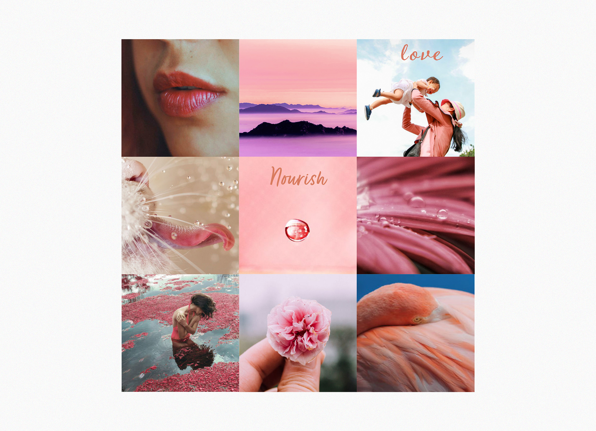
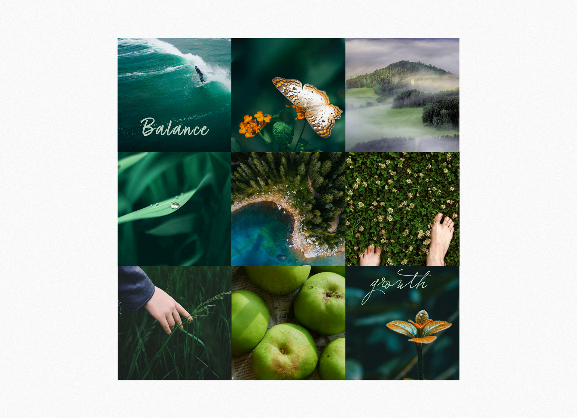
For the repurpose of the project, I chose a common topic for designers which is the meaning of colours and their applications. I created four mosaics each one focused on transmitting a different emotion inspired by the meaning of the colour. To give the artworks an extra kick in terms of impact in the message I added some text, consistent with the concept I want to inspire. Also, the selection of the fonts is in line with the whole concept. Some decisions I made might be clashing with a different perception than mine as the creative vision here is fully personal. I am happy to discuss it!
IMAGERY